From the ashes of its predecessor I present Dragons siege remastered. I made such drastic changes that I thought to open a new Topic about it. Yet feedback is still appreciated and I’d love to hear your thoughts and change the map to your desire.
Technical information
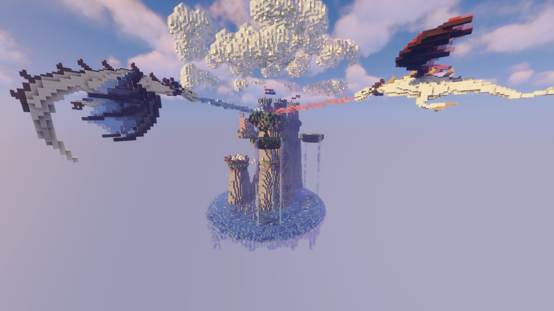
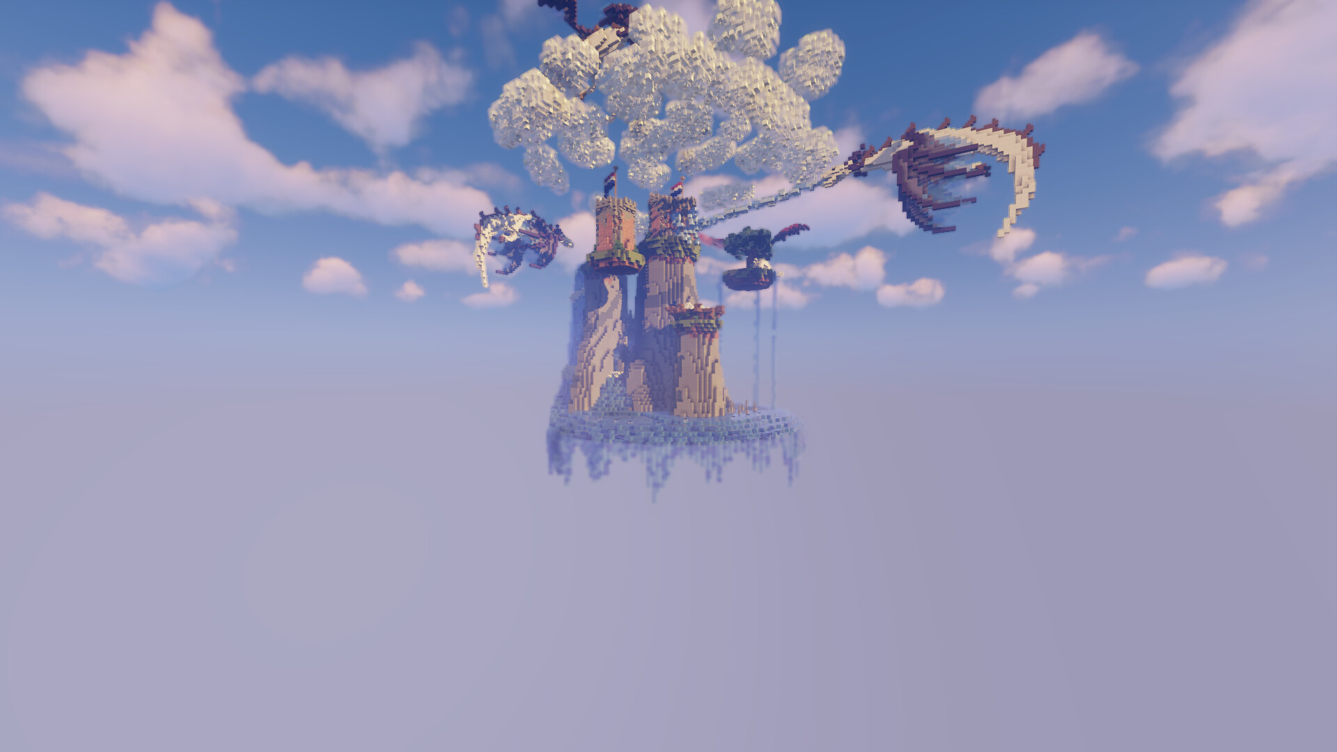
Map name: Dragons Siege max players: 24 Waiting spawn location: Lime carpet (In the fort can be seen from main entrance) Game spawn location blue carpets on the water underneath the sea lanterns Center X and Z: 0,0 Lowest Y: 50 HeightLimit: from 50 to 133 Parkour block: Iron blocks (block of iron)
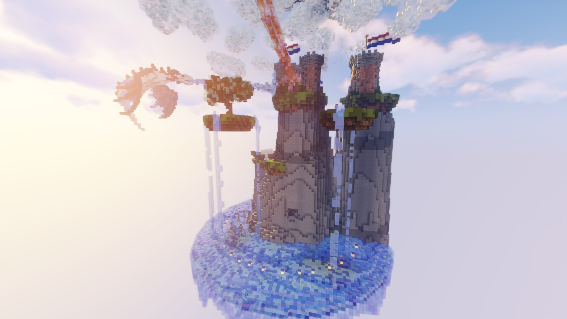
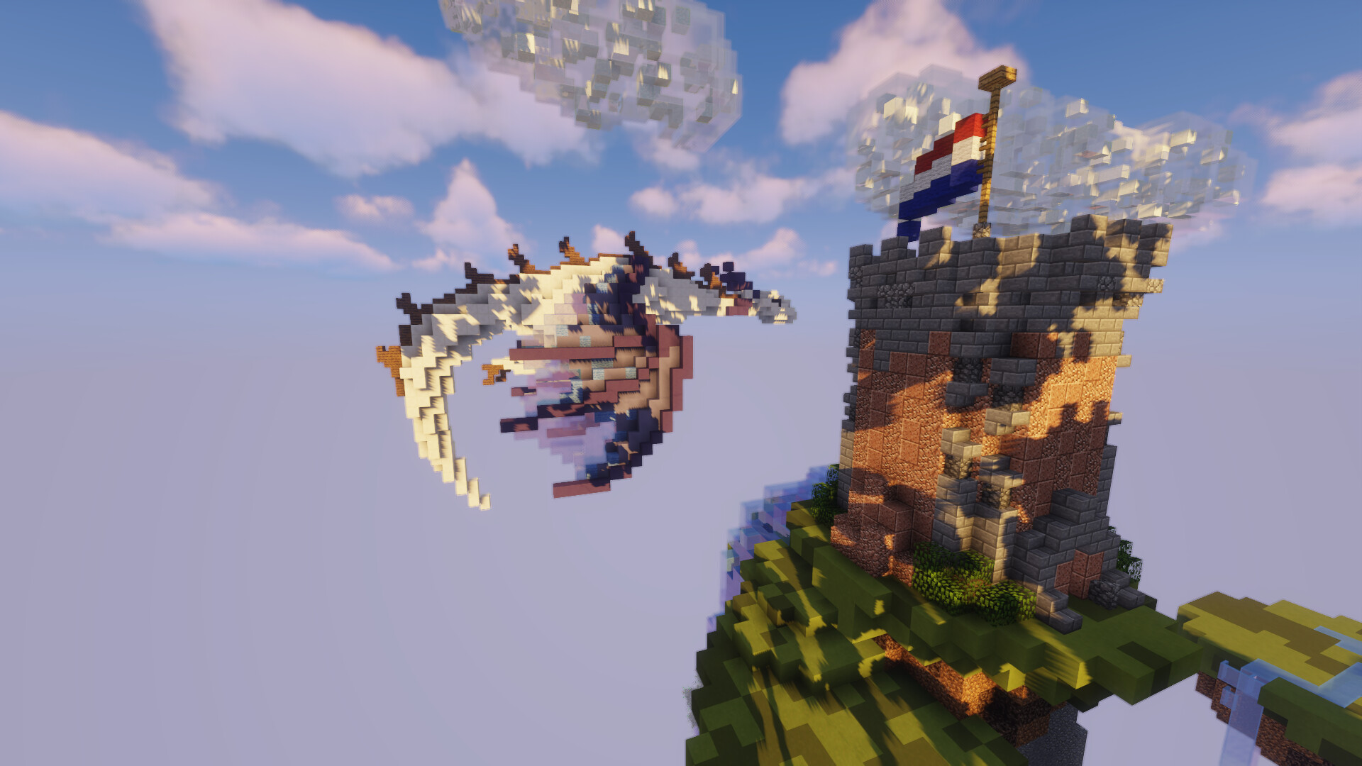
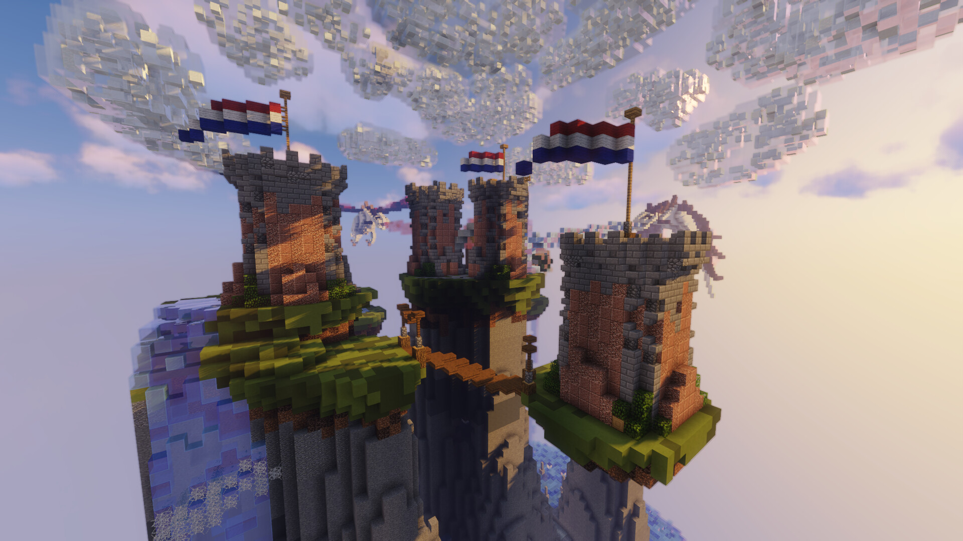
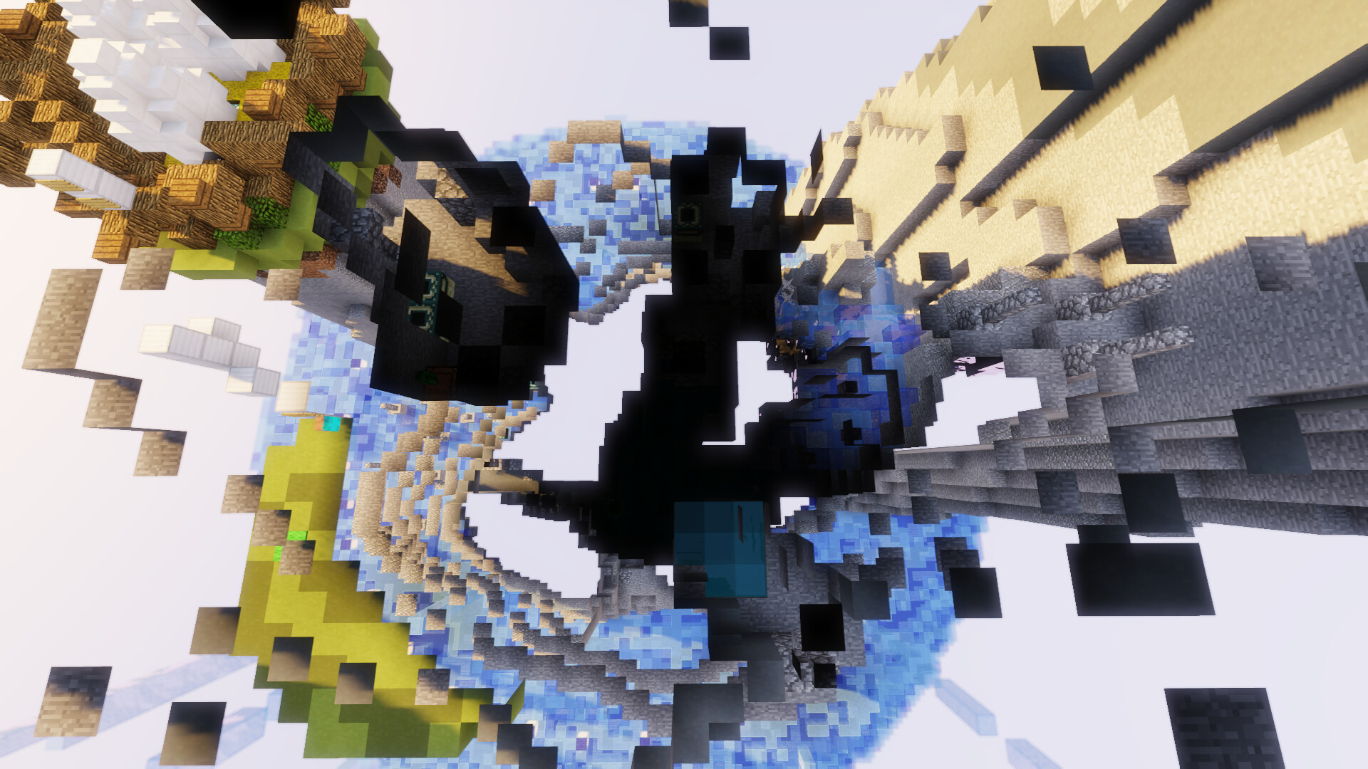
What could be found interesting is that there is no clear border to this map. Well yes. There is a border of barrier blocks which can be found by looking at the disk which the island is build upon because it aligns the border. There are two main reasons for this discission. One beeing the aesthetics as it looks way cooler and secondly to still try and funnel some pvp to the center of the map to try and make the games more compact. Ofcourse you can still build against the wall its just less obviously an option.
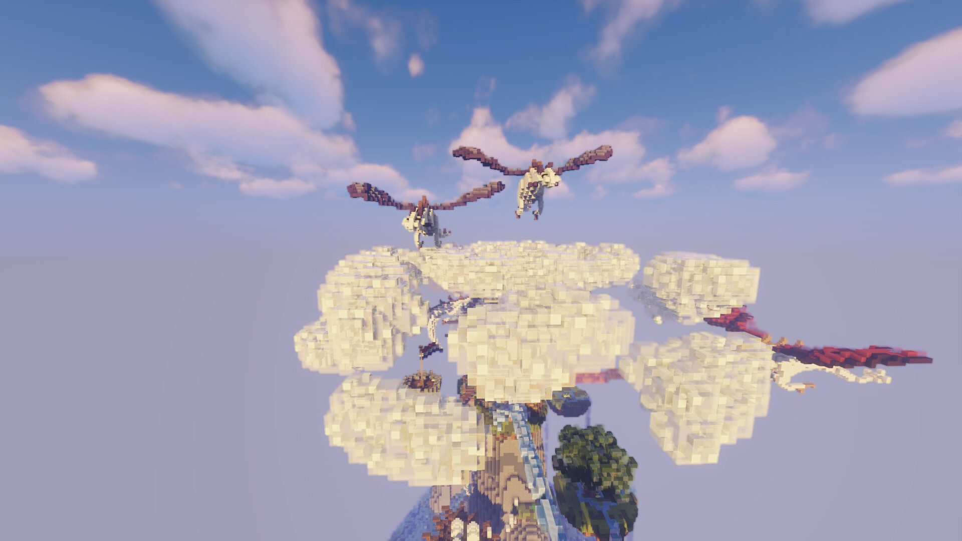
Let me know what you think about the islands. Do they need something extra like a small detail to fill some more space or are these island fine as is and will more clutter the map?
Thank you for taking the time to read this and have a damn good day.
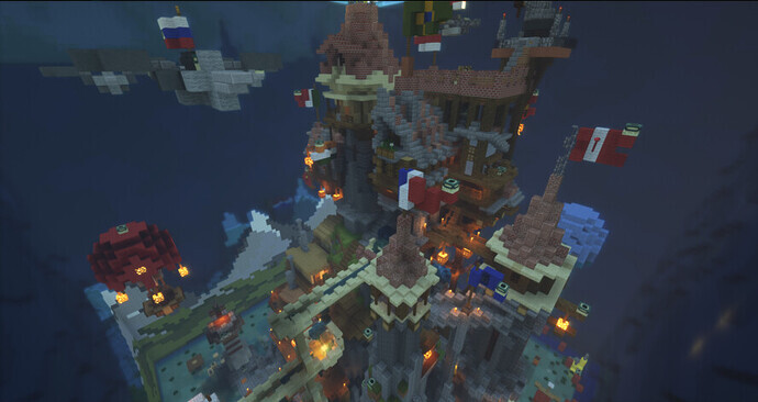
Hallo! Somehow, this map looks even better than the last. It is absolutely stunning, while not being too crowded or overdetailed.
I do think you should add something clear as the walls. Bridging on the walls is a big part of Woolwars and taking it away wouldn’t be a good thing in my opinion.
I also think you should add some floating islands or something to take a bit of the focus off of the middle. I know you’re trying to go for a middle PvP style map, but at the moment I think it’s just too PvP focused and not quite Woolwarsy enough.
Sorry if this sounds critical, I just didn’t want to spend too long praising the map. I cannot stress enough how good it looks.
lKDMSjHASDjkasgdjhagsdKJASHdbgmajshdgAK THAT LOOKS SO AWESOME!!! HUGE +1
I definitely think light blue glass as a boarder will make it easier to understand playing wise however the map looks absolutely stunning!
What JamieDactyl said, I think the map is just too PvP focused at the moment. Don’t get me wrong, the map is absolutely stunning and so well built/thought out, but i feel like playing on it would be a bit difficult.
Personally, I love all the maps which you have created so far. To get that out of the way, most of what’s said has already been. This map has spectacular design, and I wouldn’t recommend you to stop your endeavors of creating maps. However from what I’ve found, maps with no clear line for a border (i.e. with barriers), really make people hate certain maps. (cough cough WoolWars 1.0 Lobby)
One map that would be good to take inspiration from in your case, would be FlagWars Castle.
The map looks really quite well, and it has great design qualities and the such. Spectacular design, might I add, to the likeness of you I may say. However unlike this map, it has a simple yet clear border able to be noticed by any person. Before I knack on to long about comparing maps, it was something I thought I should bring up.
Besides all of the factors, the map gets a clear +1 from me. Work on more scattered islands, and the map could, and most likely would get in. Make the map seem less PvP induced, and more in the style of other accepted WoolWars maps.
Looks absolutely stunning but I still cannot see myself enjoying this map, it is all to similar to what doomed flag wars and still seems extremely pvp oriented which most woolwars players are quite frankly not a fan of. The bottom seems very empty and it isnt very easy to see the maps through this screenshots
I actually think that this map should avoid being too much like flag wars. Flag wars is probably the single most disliked map gameplay-wise mainly because of the lack of side platforms and the cramped feeling. I think that this map is already decent on its own, but with a few changes(Jamie’s comment is a good example) this could be a map that I look forward to playing on!
Thanks alot for all the kind words. Ill be working on creating a visible border and smaller details to fill more space. Defenetly dont want another woolwars 1.0 indeed. ;)
Dont worry I too find the map annoying and acknoledge the problems that overdetailing can bring to such small maps. I tend to lean towards more clean visible maps so dont worry about that!