Here’s my first woolwars map !
Please feel free to tell me if i should change or add anything to the map o/
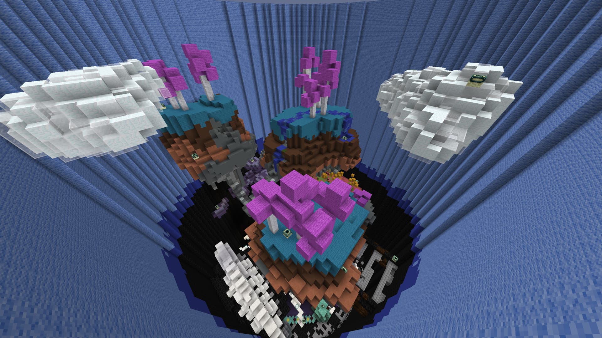
Map name:Rock bottom
Map center:0 51 0
Radius:30 blocks
podium block for when the game begin:Sponge
Spawn location:-1.5 56 -1.5
Parkour material:nether brick
Map type:Normal
Max players:24
Builder:HardlyShiftin
File:https://drive.google.com/file/d/1VW_J0wpl_4BKprn5qorEb-DZcBL9vI-a/view?usp=sharing
Thanks in advance for any feedback :D
5 Likes
Hello!
So first of all I would love it if you use the feature on the forums to add an image since it took me several attempts to view these screenshots. Anyways, I downloaded the map and had a zoom around.
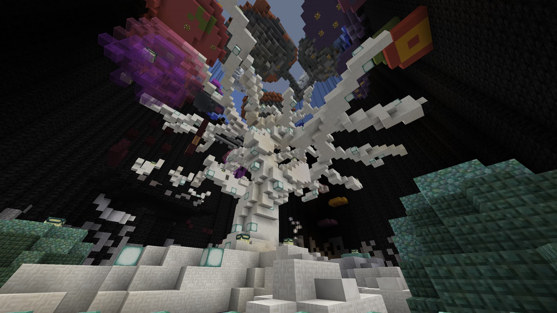
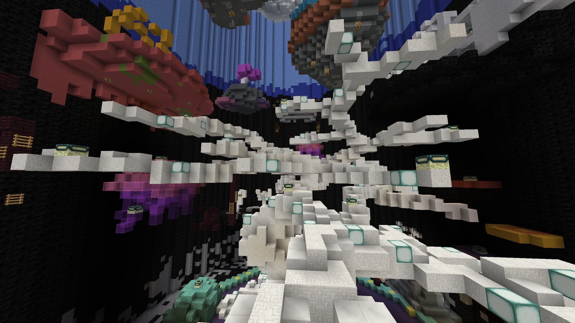
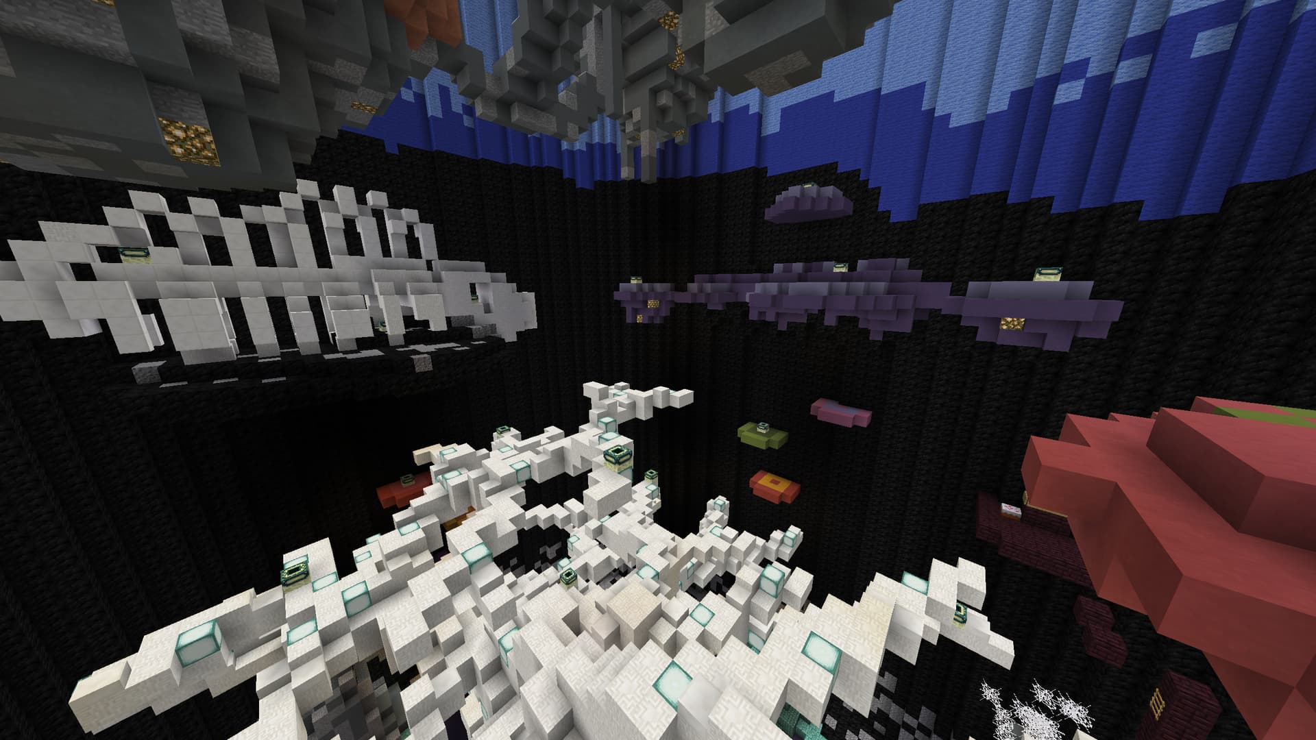
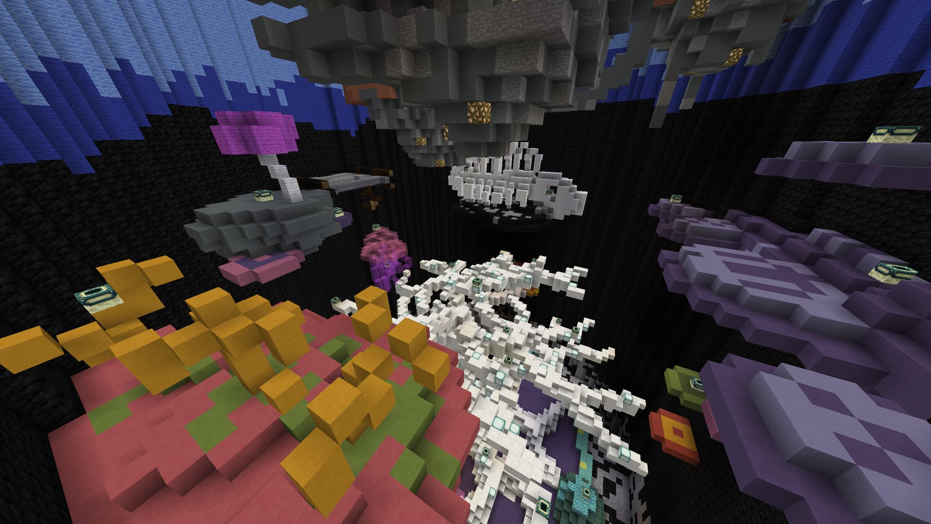
First Impressions: This is a mess, There are so many colours and blocks in this that just dont mix. If it where up to me I would play around with some other blocks in certain areas because I find it hard to focus or find a central point of the build. Due to this I also find it hard to identify a theme in the map which makes things look even more out of place such as the bridge/traintrack thing hanging from the side.
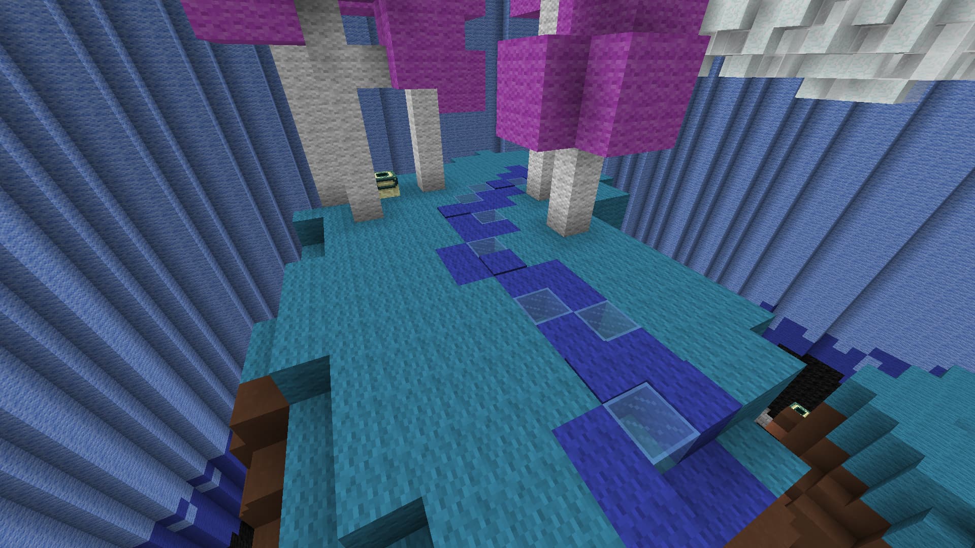
Aside from that I would also prefer you redo your walls, the colour stransitions are not smooth and dont blend. Secondly you have these large portions of wall that are flat and one block type. Im not saying it looks bad having one colour but it could look alot more sophisticated.
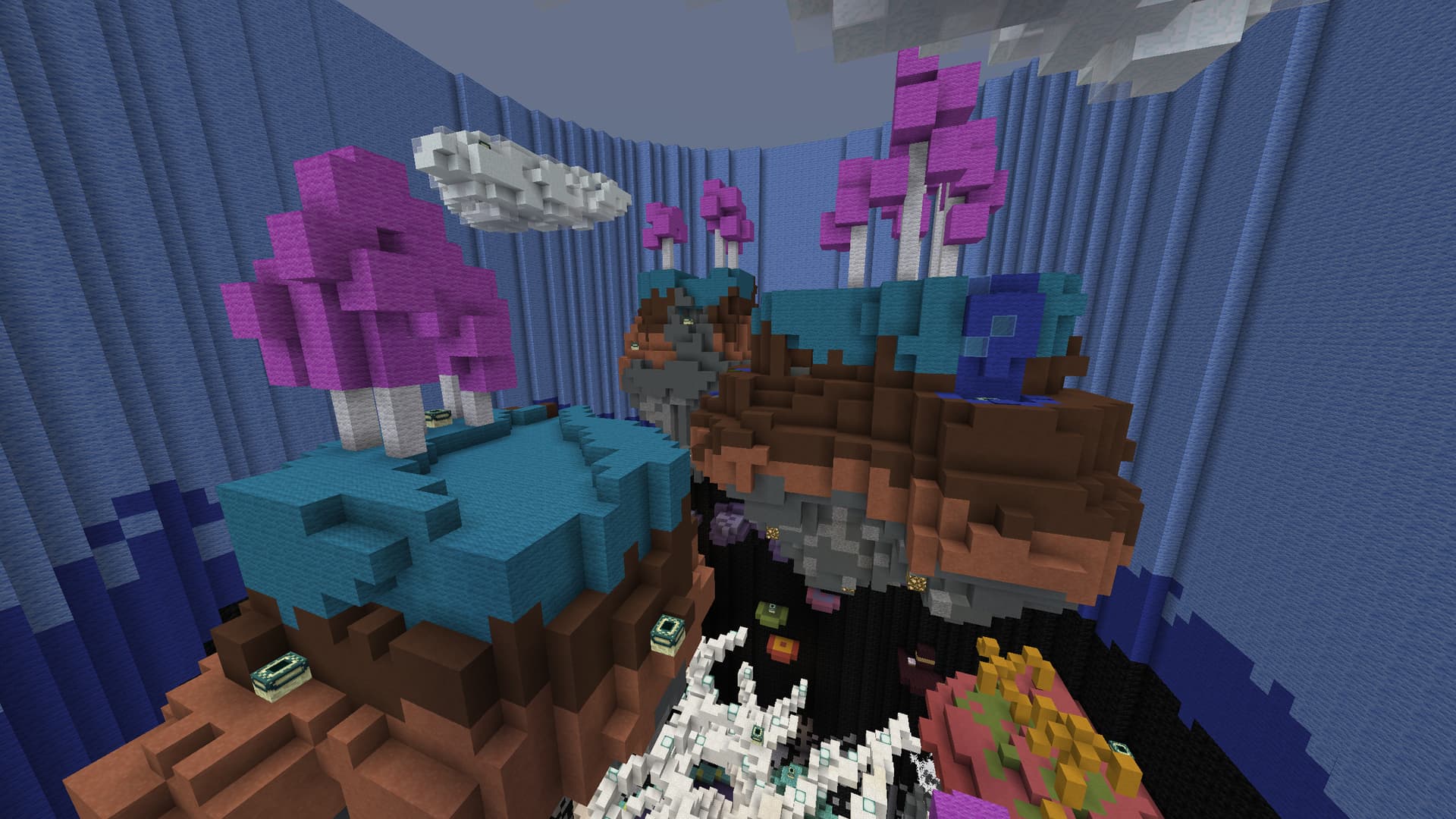
I like your small trees and think they look very nice just like the clouds. Also your ‘fish’ skeleton looks very good.
Some examples:
-
A prime example of the bad colouring are these Islands. The rivers and grass both beeing blue just dont match very well.
-
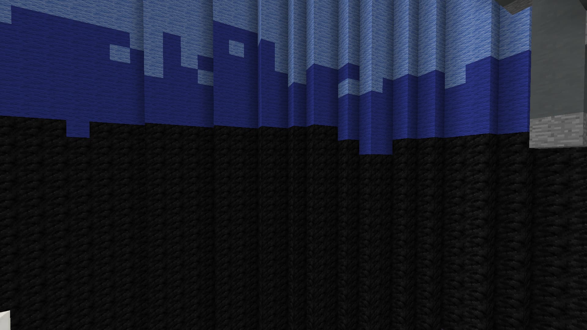
The gradient I was refering to that caught my eye was this one, it doesn’t look clean but blocky and with just a straight line in most places.
Personally I think the map doesn’t look half bad but a simple recolouring would go a long way into making it easier to look at and navigate.
I hope you found my comment useful, are successful in implementing these changes and hope to see more maps from you in the future.
Have a damn good day!
-thedutchknot
4 Likes
Thanks for your opinion It really helped me out !
I’ll start working on it as soon as I can !
3 Likes
I really like this map! Dutchnot already gave you some good aesthetic advice, but as far as gameplay I can see my self really enjoying this!
2 Likes
+0.5
Looks amazing to play, and all I would think to do is add platforms to the upper walls and just change up the merging of colors on the walls as Dutchknot said. Other than that It looks like a very nice map :)
2 Likes
Looks very cool, calm vibes and an overall good aesthetic
1 Like
Looks like a very good map to play on and would enjoy playing on it!
1 Like